Possibility of returning to Blue Helmets? | Page 2 | The Boneyard
.-.

Possibility of returning to Blue Helmets?

Are helmets still for sale at $25?
Don't think so. I thought they sold out. They were selling them for $10 about an hour before game. $10 hockey sticks were selling for $5 at halftime. Was going to get one but the check out line was yuge! They sold a lot of stuff.
 
UCONN needs to be consistent across all sports - color schemes, logos, fonts, etc.. Back in the day it was a hodgepodge - football, baseball, basketball team, and i think even the soccer team had different logos, different colors (some with red, some without, different shade of blue, etc...). The Athl Dept is trying to create a consistent brand/branding across all sports. Hopefully they continue with that. The UCONN logo should be consistent, the husky dog needs to be consistent, the colors need to be consistent, any and all logos need to be consistent. Just my opinion.
 
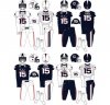
IMO I like the alternate jerseys, those look really good how they are. However, I dont really like the way both our home and away jerseys look. The main thing that throws me off are the shoulders. I dont like the way the red and white look at all.
 
.-.
Red face mask sucked. I think the white helmet with the Navy blue facemask is a way better look.

Knowing how RE operated the first go around with just blue, white, silver and eliminating red all together, I imagine he wasn't too keen on it either.
 
I'd be a fan of this helmet with the home/away jerseys looking almost identical to the spring game blue/white. Or if it's absolutely necessary to differentiate between game jersey and spring practice, then mix in red highlights on the numbers for game.
upload_2017-4-24_11-42-51.jpeg
upload_2017-4-24_11-44-3.jpeg
 
.-.
IMHO, retro uniforms represent an overly-romanticized remembrance of our past. Frankly, they're more a reminder of our Div 1AA minor league status. Let's look forward.
 
I like the white helmet with the blue facemask. That's a good look. The one thing I hate is white shirt white pants or blue shirt blue pants. I wouldn't mind permanent grey pants (like the Giants) or white on blue and blue on white. The solid color look sucks.
 
The future is clear helmets. Helmets where we can see the kid's hair. A space aged material with the clarity of crystal. Oregon is bound to be using them in just a couple years, lets beat them to the punch.
 
.-.
I wouldn't be upset with the white, blue stripe&mask. Away uniforms would look clean. I do like the block c tho. Just limit the red in uconn football please!
 

Attachments

  • IMG_6375.jpg
    IMG_6375.jpg
    32.6 KB · Views: 588
Blue looks good.

Your opinion is terrible and people should throw things at your head.

Yea, a uniform where the jersey and helmet don't match looks great. The whole point of the jerseys they wear now are supposed to be accompanied by the red facemask. Now the red on the shoulder looks out awkward and out of place. Will definitely need another redesign ASAP
 
Yea, a uniform where the jersey and helmet don't match looks great. The whole point of the jerseys they wear now are supposed to be accompanied by the red facemask. Now the red on the shoulder looks out awkward and out of place. Will definitely need another redesign ASAP
Husky5.jpg
 
.-.

Online statistics

Members online
353
Guests online
5,687
Total visitors
6,040

Forum statistics

Threads
165,281
Messages
4,429,881
Members
10,273
Latest member
#1Genofan


p
p
Top Bottom