The new helmet | Page 6 | The Boneyard

The new helmet

Status
Not open for further replies.
Joined
Aug 26, 2011
Messages
2,835
Reaction Score
8,017
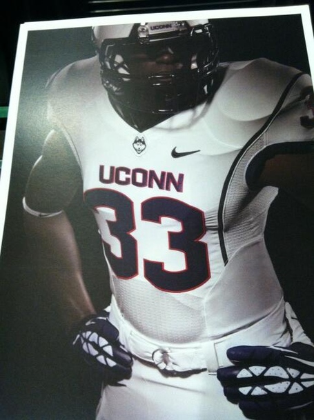
When maryland came out with that insane half & half flag design a couple years ago....no one knew it was coming until they actually wore it on the field for the game.

Either we get more new stuff for 2014...or i could see something new introduced during the season as a surprise.
 

Huskyforlife

Akokbouk
Joined
Feb 19, 2013
Messages
12,103
Reaction Score
49,109
uconnhelmet2.jpg


Am I wrong or is Smallwood wearing this prototype in this shot? (Check out the stripe pattern on the helmet crown.)

BIJieHHCcAAp_-h_medium.jpeg


Hope they eventually implement that as a 3rd helmet or something - looks good.
still love that design
 

whaler11

Head Happy Hour Coach
Joined
Aug 27, 2011
Messages
44,374
Reaction Score
68,261
The P helmet is funny. I am ok with the front helmet. Those helmets with the logo on the side are brutal.
 
Joined
Aug 26, 2011
Messages
8,178
Reaction Score
15,351
Wouldn't mind seeing a 3rd uni consisting of:

Helmet almost OSU colored sides and dark blue matte stripe with the logo front. Red (not sure) helmet grill. No UConn bumper on the back.
Grey jersey dark blue numbers and letters, white/red thin outline for the numbers only.
Dark Blue pants grey side stripe dark blue UConn letters on the sides.
 

UConnDan97

predicting undefeated seasons since 1983
Joined
Feb 12, 2012
Messages
12,031
Reaction Score
42,389
Nice find.
newhusky.png

I've already voiced my opinion of my hatred for the "call of the wild" helmets, but this is the first that I'm seeing of the side-logo "husky helmet". I think that helmet is infinitely better than the other, and I hope they go for that helmet as the main helmet. Now if I could just get Penfield to change all the helmets to make the dog "Jonathan-white"... ;)
 
Joined
Aug 30, 2011
Messages
9,017
Reaction Score
35,385
I've already voiced my opinion of my hatred for the "call of the wild" helmets, but this is the first that I'm seeing of the side-logo "husky helmet". I think that helmet is infinitely better than the other, and I hope they go for that helmet as the main helmet. Now if I could just get Penfield to change all the helmets to make the dog "Jonathan-white"... ;)

It's just..... boring.
 

UCFBfan

Semi Kings of New England!
Joined
Jan 28, 2012
Messages
5,861
Reaction Score
11,703
So I just found this for WVU uni release. They're getting rid of the Grey Uni! (Thank goodness!) One thing I noticed....at around the 1:45 mark they show the new helmets....the WVU logo looks to be matte finish as well....I know someone said the reason the husky on our helmets is glossy is because it's a decal. Well so is the WVU logo on the helmets but that's in a matte finish (at least it looks like it is). Finally....do we have a cool video revealing our unis?

Enjoy:


whaler11

Head Happy Hour Coach
Joined
Aug 27, 2011
Messages
44,374
Reaction Score
68,261
I've already voiced my opinion of my hatred for the "call of the wild" helmets, but this is the first that I'm seeing of the side-logo "husky helmet". I think that helmet is infinitely better than the other, and I hope they go for that helmet as the main helmet. Now if I could just get Penfield to change all the helmets to make the dog "Jonathan-white"... ;)

As a fellow old man totally on opposite side. I can accept the front 'husky'. Hate it on the side of the helmet.
 
Joined
Aug 26, 2011
Messages
26,191
Reaction Score
31,680
Front husky is better. I actually like the whole getup as a package.
 
Joined
Aug 27, 2011
Messages
6,578
Reaction Score
16,671
All the players love the logo and the uniforms, and from what i'm told...players are important in athletics. Much more so than message board posters.

So it looks as if you're gonna have to live with it.
Actually, the 30,000+ ticketholders are relevant, unless we are returning to Yankee Conference level football...this is nothing
more than a distraction and waste of time and effort that has no impact on field.
There is no uniform that compensates for losing. Give me plain block C blue and white smash mouth uniforms and Ws.
 
Joined
Sep 3, 2011
Messages
3,698
Reaction Score
3,204
The helmuts are a "swing and a miss". The Blue Helmut needs to stay with the Block C . . . period. I might be OK with the White Helmut having the new logo on the front. It would have to serve as an alternate look (once in a while only) but that's it. A white helmut with a blue Block C would have been the better way to go.

As for the all white away uniforms? Not cool. White top, blue pants is the way to go. All white makes players look smaller.

Applaude the effort to shake things up, but don't want to become Randy U North.
 
Joined
Aug 26, 2011
Messages
2,835
Reaction Score
8,017
Actually, the 30,000+ ticketholders are relevant, unless we are returning to Yankee Conference level football...this is nothing
more than a distraction and waste of time and effort that has no impact on field.
There is no uniform that compensates for losing. Give me plain block C blue and white smash mouth uniforms and Ws.

I didn't say irrelevant, i said less important.

And that's the whole point. PLAYERS LIKE THEM !!! PLAYERS WIN GAMES.
 
Joined
Feb 21, 2012
Messages
1,241
Reaction Score
5,999
The helmuts are a "swing and a miss". The Blue Helmut needs to stay with the Block C . . . period. I might be OK with the White Helmut having the new logo on the front. It would have to serve as an alternate look (once in a while only) but that's it. A white helmut with a blue Block C would have been the better way to go.

As for the all white away uniforms? Not cool. White top, blue pants is the way to go. All white makes players look smaller.

Applaude the effort to shake things up, but don't want to become Randy U North.

WTF is a Helmut? Only thing I could find on the internet is Helmut Lang designer dresses (www.helmutlang.com). I know Nike goes to extremes to garner attention for their schools, but I def agree, dresses go way too far and crosses the line.
 

UConnDan97

predicting undefeated seasons since 1983
Joined
Feb 12, 2012
Messages
12,031
Reaction Score
42,389
As a fellow old man totally on opposite side. I can accept the front 'husky'. Hate it on the side of the helmet.

Yeah, we are both soon to be looking for the "Fountain of Middle Age". ;)

I look at the side logo and think of other helmets that I believe are a good look and successful in marketing (like Louisville's bird, for example). I just cannot see the front-facing logo lasting for more than a year or two, and I don't think that it's going to come across as a good look when they take the field with it. It even looks bad on a "conference helmet schedule"!!!
 
Status
Not open for further replies.

Online statistics

Members online
173
Guests online
3,810
Total visitors
3,983

Forum statistics

Threads
157,041
Messages
4,078,406
Members
9,973
Latest member
WillngtnOak


Top Bottom