
You are using an out of date browser. It may not display this or other websites correctly.
You should upgrade or use an alternative browser.
You should upgrade or use an alternative browser.
OT: What are the best sport logos/uni's in any sport
- Thread starter B1GEast
- Start date
CL82
James Breeding sucks
- Joined
- Aug 24, 2011
- Messages
- 63,950
- Reaction Score
- 251,329
Reread your posts and see if you can figure it out.How did I "start one and double down on it"?
CL82
James Breeding sucks
- Joined
- Aug 24, 2011
- Messages
- 63,950
- Reaction Score
- 251,329
The one immediately prior to that one was far better.
Debatable, but definitely in the top two.
- Joined
- Aug 26, 2011
- Messages
- 10,485
- Reaction Score
- 41,625
View attachment 109954
Debatable, but definitely in the top two.
View attachment 109912
Disagree.
Ran this by my kids and and a couple of their friends. They unanimously think the old logo is dated and soft looking. They all prefer the new logo by a lot. That probably answers the question as to why the decision was made. It was time. Old timers tend to hang onto the past, me included. That's why I cling to the Whalers. If we want a logo that doesn't ever need updating, we need to switch to the Block C. Character logos need to be changed now and then.
I actually hated the old logo for years, so not only was i glad to see it go, then I lucked out by loving the new one. I think it is sleek and looks really smooth on a blue hoody, dress shirt, hat and most other applications. Its just really clean.
- Joined
- Aug 4, 2018
- Messages
- 1,589
- Reaction Score
- 8,043
I'm posting this . . . then I'm stepping back to avoid the backlash.

- Joined
- Aug 24, 2011
- Messages
- 26,059
- Reaction Score
- 70,656
Brewers is A+For similar reasons to why I love the Whalers logo, I think the Milwaukee Brewers MB in the form of a glove and the Devils NJ logo with horns and a tail are among the absolute best in pro sports.
.-.
- Joined
- Aug 24, 2011
- Messages
- 11,423
- Reaction Score
- 17,376
You mean "worst?" The White Sox jersey with a collar is universally, without exception, mentioned as the worst uniform in all of baseball, if not of all sports. If you lie with dogs...
View attachment 109947
That was one season in 76. I meant 80's but still some of the 70's White Sox uni's were nice.
Some people always look for the exceptions instead of big picture.
- Joined
- Sep 16, 2011
- Messages
- 56,454
- Reaction Score
- 215,811
That guy is the best.Dave Parker macking out Pirate's uni's like a bossView attachment 109959
CL82
James Breeding sucks
- Joined
- Aug 24, 2011
- Messages
- 63,950
- Reaction Score
- 251,329
Yes, it does, well, provided that there was a focus group consisting of your kids and their friends and the decision was based on that.Ran this by my kids and and a couple of their friends. They unanimously think the old logo is dated and soft looking. They all prefer the new logo by a lot. That probably answers the question as to why the decision was made
It's a weird topic because everyone has a different basis for their opinion. Some people think the old logo was too cartoony, some people think the new logo is too cartoony, or looks too much like clipart.
For me, I think it's always a mistake to give up a unique brand for a generic brand. We were the only team, anywhere, to have an all white husky as a mascot. Getting rid of that unique logo and changing to a generic logo is a mistake from a marketing perspective.
Susan Herbst that she made the decision to change it because "there was no such thing as a white husky". Some people here share that view that is absolutely wrong and tremendously ignorant for her to say that given the fact that we had had white Huskies as mascots for 80 years and she actually replaced a white husky with a generic husky. For the record, from 1935 through 2013 we had an all white husky as our mascot.
Some people say that the old mascot was "too fluffy" or looked like a Samoyed. I'd have to go look it up, but actually, I think our third husky was actually a Samoyed husky. To me, the fluffiness doesn't matter, but I would have no qualms with a shorter haired white husky because that's consistent with the brand we established.
It's a moot issue though until Dave Benedict retires. For whatever reason he wants a wolf as a mascot and that's why he got caught ripping off NC State's Wolfpack traditions. Or, unless I win, mega millions, in which case I'll put a significant down payment on an on campus stadium contingent upon us going back to a white husky, thus killing two birds with one stone.
")
pepband99
Resident TV nerd
- Joined
- Aug 26, 2011
- Messages
- 3,975
- Reaction Score
- 10,443
Yes, it does, well, provided that there was a focus group consisting of your kids and their friends and the decision was based on that.
It's a weird topic because everyone has a different basis for their opinion. Some people think the old logo was too cartoony, some people think the new logo is too cartoony, or looks too much like clipart.
For me, I think it's always a mistake to give up a unique brand for a generic brand. We were the only team, anywhere, to have an all white husky as a mascot. Getting rid of that unique logo and changing to a generic logo is a mistake from a marketing perspective.
Susan Herbst that she made the decision to change it because "there was no such thing as a white husky". Some people here share that view that is absolutely wrong and tremendously ignorant for her to say that given the fact that we had had white Huskies as mascots for 80 years and she actually replaced a white husky with a generic husky. For the record, from 1935 through 2013 we had an all white husky as our mascot.
Some people say that the old mascot was "too fluffy" or looked like a Samoyed. I'd have to go look it up, but actually, I think our third husky was actually a Samoyed husky. To me, the fluffiness doesn't matter, but I would have no qualms with a shorter haired white husky because that's consistent with the brand we established.
View attachment 109961
It didn't look like a samoyed - it was a samoyed. The artist rendered a "husky" after his own pet samoyed.
.-.
CL82
James Breeding sucks
- Joined
- Aug 24, 2011
- Messages
- 63,950
- Reaction Score
- 251,329
Nope, he drew his picture of a husky, because that's what he was drawing, using his Samoyed as a model. For what it's worth, as noted above, we have used and all white Samoyed husky as our actual living mascot. I'd have to go look, but I think it was the third one.It didn't look like a samoyed - it was a samoyed. The artist rendered a "husky" after his own pet samoyed.
Edit: Here it is:
(By the way, the AD "memory-holed" this page. Fortunately, the Internet never forgets.)
Last edited:
dvegas
Duck Fuke
- Joined
- May 1, 2012
- Messages
- 1,930
- Reaction Score
- 5,149
Dave Parker macking out Pirate's uni's like a bossView attachment 109959
The goalie mask get up was pretty awesome also!
- Joined
- Sep 16, 2011
- Messages
- 56,454
- Reaction Score
- 215,811
The logo used to be a Samoyed. I'm really happy they changed the logo to a Husky, it's a great looking logo.Yes, it does, well, provided that there was a focus group consisting of your kids and their friends and the decision was based on that.
It's a weird topic because everyone has a different basis for their opinion. Some people think the old logo was too cartoony, some people think the new logo is too cartoony, or looks too much like clipart.
For me, I think it's always a mistake to give up a unique brand for a generic brand. We were the only team, anywhere, to have an all white husky as a mascot. Getting rid of that unique logo and changing to a generic logo is a mistake from a marketing perspective.
Susan Herbst that she made the decision to change it because "there was no such thing as a white husky". Some people here share that view that is absolutely wrong and tremendously ignorant for her to say that given the fact that we had had white Huskies as mascots for 80 years and she actually replaced a white husky with a generic husky. For the record, from 1935 through 2013 we had an all white husky as our mascot.
Some people say that the old mascot was "too fluffy" or looked like a Samoyed. I'd have to go look it up, but actually, I think our third husky was actually a Samoyed husky. To me, the fluffiness doesn't matter, but I would have no qualms with a shorter haired white husky because that's consistent with the brand we established.
View attachment 109961
It's a moot issue though until Dave Benedict retires. For whatever reason he wants a wolf as a mascot and that's why he got caught ripping off NC State's Wolfpack traditions. Or, unless I win, mega millions, in which case I'll put a significant down payment on an on campus stadium contingent upon us going back to a white husky, thus killing two birds with one stone.
CL82
James Breeding sucks
- Joined
- Aug 24, 2011
- Messages
- 63,950
- Reaction Score
- 251,329
Nope. The school mascot has always been a white husky until 2013. Sometimes the physical dog has been a Samoyed husky.The logo used to be a Samoyed. I'm really happy they changed the logo to a Husky, it's a great looking logo.
But, I know you know all this, you and I having talked about it time and time again.
- Joined
- Aug 26, 2011
- Messages
- 10,485
- Reaction Score
- 41,625
Yes, it does, well, provided that there was a focus group consisting of your kids and their friends and the decision was based on that.
It's a weird topic because everyone has a different basis for their opinion. Some people think the old logo was too cartoony, some people think the new logo is too cartoony, or looks too much like clipart.
For me, I think it's always a mistake to give up a unique brand for a generic brand. We were the only team, anywhere, to have an all white husky as a mascot. Getting rid of that unique logo and changing to a generic logo is a mistake from a marketing perspective.
Susan Herbst that she made the decision to change it because "there was no such thing as a white husky". Some people here share that view that is absolutely wrong and tremendously ignorant for her to say that given the fact that we had had white Huskies as mascots for 80 years and she actually replaced a white husky with a generic husky. For the record, from 1935 through 2013 we had an all white husky as our mascot.
Some people say that the old mascot was "too fluffy" or looked like a Samoyed. I'd have to go look it up, but actually, I think our third husky was actually a Samoyed husky. To me, the fluffiness doesn't matter, but I would have no qualms with a shorter haired white husky because that's consistent with the brand we established.
View attachment 109961
It's a moot issue though until Dave Benedict retires. For whatever reason he wants a wolf as a mascot and that's why he got caught ripping off NC State's Wolfpack traditions. Or, unless I win, mega millions, in which case I'll put a significant down payment on an on campus stadium contingent upon us going back to a white husky, thus killing two birds with one stone.
Lol. Yeah, my kids aren’t the be all end all. My point was that younger people prefer the new logo. It was time for an update. However, I have long supported you on the all white husky point. I felt that renderings of the current logo in all white made sense and looked great.
.-.
- Joined
- Feb 17, 2020
- Messages
- 3,327
- Reaction Score
- 10,153
I don't have to reread it. I wrote it and I did neither.Reread your posts and see if you can figure it out.
FfldCntyFan
Texas: Property of UConn Men's Basketball program
- Joined
- Aug 25, 2011
- Messages
- 15,636
- Reaction Score
- 62,611
Yes, it does, well, provided that there was a focus group consisting of your kids and their friends and the decision was based on that.
It's a weird topic because everyone has a different basis for their opinion. Some people think the old logo was too cartoony, some people think the new logo is too cartoony, or looks too much like clipart.
For me, I think it's always a mistake to give up a unique brand for a generic brand. We were the only team, anywhere, to have an all white husky as a mascot. Getting rid of that unique logo and changing to a generic logo is a mistake from a marketing perspective.
Susan Herbst that she made the decision to change it because "there was no such thing as a white husky". Some people here share that view that is absolutely wrong and tremendously ignorant for her to say that given the fact that we had had white Huskies as mascots for 80 years and she actually replaced a white husky with a generic husky. For the record, from 1935 through 2013 we had an all white husky as our mascot.
Some people say that the old mascot was "too fluffy" or looked like a Samoyed. I'd have to go look it up, but actually, I think our third husky was actually a Samoyed husky. To me, the fluffiness doesn't matter, but I would have no qualms with a shorter haired white husky because that's consistent with the brand we established.
View attachment 109961
It's a moot issue though until Dave Benedict retires. For whatever reason he wants a wolf as a mascot and that's why he got caught ripping off NC State's Wolfpack traditions. Or, unless I win, mega millions, in which case I'll put a significant down payment on an on campus stadium contingent upon us going back to a white husky, thus killing two birds with one stone.
Yes, there are pure white huskies and yes, for roughly eight decades our mascot was a white husky. The logos from the 1950's (possibly longer, I only know of logos that go back that far) had been of a pure white dog until the current logo. The logo that you referenced on page two of this thread had an appearance that resembled a stuffed animal far more than it resembled a real dog and it resembled a samoyed far more than it resembled a husky.Nope, he drew his picture of a husky, because that's what he was drawing, using his Samoyed as a model. For what it's worth, as noted above, we have used and all white Samoyed husky as our actual living mascot. I'd have to go look, but I think it was the third one.
Edit: Here it is:
View attachment 109962
(By the way, the AD "memory-holed" this page. Fortunately, the Internet never forgets.)
Chin Diesel
I've always been crazy but it's kept me from going
- Joined
- Aug 24, 2011
- Messages
- 35,331
- Reaction Score
- 119,015
Dave Parker macking out Pirate's uni's like a bossView attachment 109959
H
He could swing a stick. And a cannon for an arm.That guy is the best.
Loved watching so many of the big-armed RF's in 70's and 80's.
- Joined
- Jan 14, 2016
- Messages
- 4,066
- Reaction Score
- 9,300
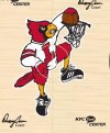
Disco turkeys. Wood bat league.Some of these are not my team, but I like either the logo, uni's or both
Raiders logo
Celtics logo
Mighty Ducks logo
Dolphins uniforms
Chargers Uniforms
Whalers Logo
Previous Husky logo
These are just a few, what are some of yours?
CL82
James Breeding sucks
- Joined
- Aug 24, 2011
- Messages
- 63,950
- Reaction Score
- 251,329
Agree.Lol. Yeah, my kids aren’t the be all end all. My point was that younger people prefer the new logo. It was time for an update. However, I have long supported you on the all white husky point. I felt that renderings of the current logo in all white made sense and looked great.
CL82
James Breeding sucks
- Joined
- Aug 24, 2011
- Messages
- 63,950
- Reaction Score
- 251,329
Actually, you did. You were the first person to make a comparison of the husky logos, and and then you double down by making a Samoyed reference. I thought you'd be able to work that out on your own, but I'm glad to help.I don't have to reread it. I wrote it and I did neither.
.-.
CL82
James Breeding sucks
- Joined
- Aug 24, 2011
- Messages
- 63,950
- Reaction Score
- 251,329
I don't disagree with any of this.Yes, there are pure white huskies and yes, for roughly eight decades our mascot was a white husky. The logos from the 1950's (possibly longer, I only know of logos that go back that far) had been of a pure white dog until the current logo. The logo that you referenced on page two of this thread had an appearance that resembled a stuffed animal far more than it resembled a real dog and it resembled a samoyed far more than it resembled a husky.
- Joined
- Feb 17, 2020
- Messages
- 3,327
- Reaction Score
- 10,153
Whatever you say.Actually, you did. You were the first person to make a comparison of the husky logos, and and then you double down by making a Samoyed reference. I thought you'd be able to work that out on your own, but I'm glad to help.
ConnHuskBask
Shut Em Down!
- Joined
- Aug 27, 2011
- Messages
- 9,199
- Reaction Score
- 34,411

CL82
James Breeding sucks
- Joined
- Aug 24, 2011
- Messages
- 63,950
- Reaction Score
- 251,329
You're welcomeWhatever you say.
pepband99
Resident TV nerd
- Joined
- Aug 26, 2011
- Messages
- 3,975
- Reaction Score
- 10,443
Yes, it does, well, provided that there was a focus group consisting of your kids and their friends and the decision was based on that.
It's a weird topic because everyone has a different basis for their opinion. Some people think the old logo was too cartoony, some people think the new logo is too cartoony, or looks too much like clipart.
For me, I think it's always a mistake to give up a unique brand for a generic brand. We were the only team, anywhere, to have an all white husky as a mascot. Getting rid of that unique logo and changing to a generic logo is a mistake from a marketing perspective.
Susan Herbst that she made the decision to change it because "there was no such thing as a white husky". Some people here share that view that is absolutely wrong and tremendously ignorant for her to say that given the fact that we had had white Huskies as mascots for 80 years and she actually replaced a white husky with a generic husky. For the record, from 1935 through 2013 we had an all white husky as our mascot.
Some people say that the old mascot was "too fluffy" or looked like a Samoyed. I'd have to go look it up, but actually, I think our third husky was actually a Samoyed husky. To me, the fluffiness doesn't matter, but I would have no qualms with a shorter haired white husky because that's consistent with the brand we established.
View attachment 109961
It's a moot issue though until Dave Benedict retires. For whatever reason he wants a wolf as a mascot and that's why he got caught ripping off NC State's Wolfpack traditions. Or, unless I win, mega millions, in which case I'll put a significant down payment on an on campus stadium contingent upon us going back to a white husky, thus killing two birds with one stone.
You don't think Jonathan XV looks like the logo? I guess you'll call him a "wolf husky" next.
This whole thing is so tired. The. Artist's. Dog. Was. A. Samoyed. The logo looks like a Samoyed. You can complain about the white husky actual mascot (somewhat valid), but the logo isn't even really a question.
.-.