- Joined
- Sep 20, 2011
- Messages
- 415
- Reaction Score
- 414
I like em

 This is 2012 let get with the program. Do It!
i think it's as hideous as Kramer when he smoked!
Very cool.
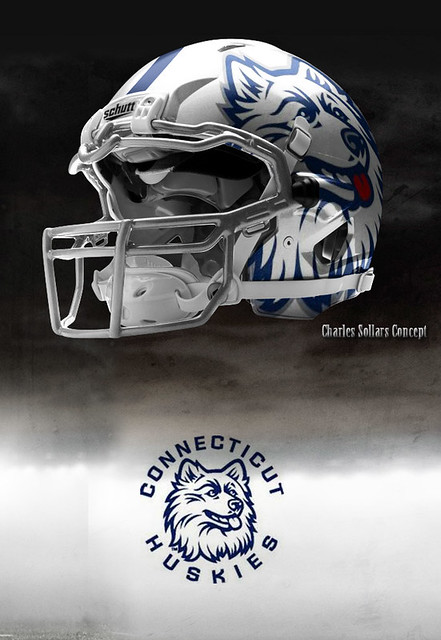

Block C has become our football identity
That is incorrect. There have been plenty of times where ESPN used the block "C" logo for basketball highlight reels.The Husky face has been and will always be UConn's logo. That's the brand that people identify the University of Connecticut with. When you see the Huskies insignia on ESPN or CBS it isn't a block C. That block C is stale and boring and something you do not want associated with a growing, thriving university. Go with the very cool looking concept helmet. National flag blue helmet w/ white logo for dark uniforms, white helmet w/ natioanl flag blue logo on white uniforms. It's coordinated, modern, different and unique.
That is incorrect. There have been plenty of times where ESPN used the block "C" logo for basketball highlight reels.
Oregon uses a block "O". Tell Phil Knight he has it wrong.
http://www.sportslogos.net/logo.php?id=ehrrx1qjof2owakh79jq
Look at Oregon's logos they've used in the past. They were using Donald Duck up until 1993. They've been using the block "O" since 1999.
According to here, we've been using the block "C" since 1996. That seems incorrect. But the block "C" seems well received on that site.
http://www.sportslogos.net/team.php?id=884[/quote]).
Block C has become our football identity, why go back? Should we start using costumes instead of uniforms like Maryland? Love and always will the block C .......
I love the block C, I think its great....I don't buy any UConn gear with the interlocking UC anymore. That being said.....If a concept helmet like this were ever to come to fruition and we busted out one of these slick helmets once a year for homecoming or a big night game, it would be flat out awesome!
Absolutely nothing wrong with a little flair every now and then
I've worn my block C hat all over the place travelling for work (Texas, Cali, Florida, even Ohio, Iowa and Nebraska - people do recognize it. Not like the block M or Bama's A, etc... But it is gaining awareness.Not to be snide (but I'm going to be) - who outside of Connecticut recognizes the block C?
Does the block C look good? Yes. But it has ZERO marketing value. UConn built its prominence off the damned Husky dog whether or not you like it.
Watching "College Gameday" on ESPNU live in Storrs. I see a lot of UConn t-shirts, loads of Husky logos like what's on the concept helmets but no block C. I rest my case. Lose the block C. It's boring.
You can try complaining about that to Herbst. She wore the block "C". At a basketball game.