
You are using an out of date browser. It may not display this or other websites correctly.
You should upgrade or use an alternative browser.
You should upgrade or use an alternative browser.
rutgers uniforms
- Thread starter Dann
- Start date
- Status
- Not open for further replies.
- Joined
- Oct 8, 2011
- Messages
- 1,948
- Reaction Score
- 3,750
looks like Sacred Heartwe need to ban Nike from producing uniforms...for any sport...when did Rutgers colors become scarlet and grey?
- Joined
- Sep 3, 2011
- Messages
- 3,703
- Reaction Score
- 3,218
Alright, I'll say it. I like them, and I'd love to see some similar UConn designs. I've long been a fan of black as a 3rd uni for maybe 1 game a year.
Agreed. Would like to see UConn have an "alternate" uniform.
- Joined
- Aug 26, 2011
- Messages
- 5,285
- Reaction Score
- 9,284
I usually like these newer uni's, but not loving RU's version. I do like the all black, but they should have had a black helmet too). Not a fan of the other two.
I like our traditional uni's as they are now, but would be great to have a third kit for one game a year.
I like our traditional uni's as they are now, but would be great to have a third kit for one game a year.
- Joined
- Dec 9, 2011
- Messages
- 123
- Reaction Score
- 362
I like the uniforms, the helmets not so much. Definitely like idea of a third alternative uniform for us. Maybe black for 1 game a year just to help create a little more buzz. Or something else to just create a little more excitement. But I definitely do not want huge changes to our uniforms.
- Joined
- Aug 29, 2011
- Messages
- 12,429
- Reaction Score
- 19,924
I guess I don't get the infatuation with black uniforms. Army, Central Florida, sure, but Rutgers or UCONN? Not so much. And the helmets really should be the one thing that remains constant in my mind. Seems like everyone is going with these metalic looking things without regard for color. I sort of like our more traditional look, particularly blue shirts and white pants or all white with the blue helmet. Not too sure why we'd change to black when we already have 4 combinations we can use. Seems to me its a silly thing to do just because you can.
U
UConn9604
Speaking of OT RU topics, Schiano just signed Eric Legrand to a free agent contract:
http://mobile.nj.com/advnj/pm_29222/contentdetail.htm?contentguid=1VqCKrUH
http://mobile.nj.com/advnj/pm_29222/contentdetail.htm?contentguid=1VqCKrUH
junglehusky
Molotov Cocktail of Ugliness
- Joined
- Aug 24, 2011
- Messages
- 7,183
- Reaction Score
- 15,535
I think Rutgers has an identity crisis with their look (whether they have an identity crisis with the football team is another issue). In the pre-Schiano days they had a logo that recalled old-timey fonts, appealing to Rutgers' history as one of the older universities around and also the 'birthplace of college football" angle:
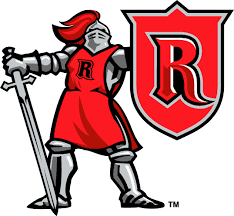
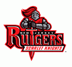
Then they switched to the block R, and the font of the "Rutgers" wordmark reflected that... sort of a basic look, perhaps fitting for a fanbase that is clamoring to get into the Big Ten.The basketball teams (and I assume all the other teams) changed to this style.
Their look now is a hodgepodge of the script look and the block look. The numbers have a distinctive look / font along the lines of the "old timey" wordmark, but it clashes with the basic "Rutgers" font. Meh.
pepband99
Resident TV nerd
- Joined
- Aug 26, 2011
- Messages
- 3,718
- Reaction Score
- 9,513
Michigan St has the same problem - 50 logos...
http://www.google.com/imgres?hl=en&...7&start=25&ndsp=31&ved=1t:429,r:21,s:25,i:176
http://www.google.com/imgres?hl=en&...0&ndsp=25&ved=1t:429,r:1,s:0,i:72&tx=40&ty=75
http://www.google.com/imgres?hl=en&...sp=27&ved=1t:429,r:14,s:56,i:229&tx=107&ty=24
http://www.google.com/imgres?hl=en&...dsp=27&ved=1t:429,r:10,s:56,i:220&tx=53&ty=42
FFS - crap or get off the pot!
- Joined
- Feb 4, 2012
- Messages
- 1,262
- Reaction Score
- 1,222
Don't even think about messing with our unis and helmets. They are fantastic just the way they are.
I have to disagree man. Even though Im a fan of our uniforms too it's all about style and swagg now nd days. How are we going to bring in top recruits if we can't keep up with the trend? believe it or not it's not winning because we won big games plenty of times. For example, S. Carolina, Notre Damn twice, W. Virginia, Baylor twice and we still don't get big recruits not even from our own state.. I think we need to upgrade with the uniforms and keep up with the trend. It's also funny how every Football and Basketball program have the same trend and we don't. Our Basketball program is Uconn and the football program is Connecticut.. What is that? Our Basketball program colors are Red, Navy Blue, White, and grey and the football program is Blue and White with black cleats WTF!! If we keep the same trend as our Basketball team like every other school and we'll have some red in the uniforms.
- Joined
- Sep 13, 2011
- Messages
- 189
- Reaction Score
- 152
It'd be interesting to see if they could apply lenticular printing technology (which gives the illusion of motion) to produce the "C" on the helmets, and the numbers and names on the uniforms. Think of visually almost mesmerizing distraction it would cause our opponents.
CL82
NCAA Men’s Basketball National Champions - Again!
- Joined
- Aug 24, 2011
- Messages
- 57,079
- Reaction Score
- 209,473
we need to ban Nike from producing uniforms...for any sport...when did Rutgers colors become scarlet and grey?
I know, right? It's like a buyer a Nike messed up on a decimel point on a grey fabric. They are throwing that stuff everywhere.
- Joined
- Sep 3, 2011
- Messages
- 3,703
- Reaction Score
- 3,218
I sort of like our more traditional look, particularly blue shirts and white pants or all white with the blue helmet. Not too sure why we'd change to black when we already have 4 combinations we can use. Seems to me its a silly thing to do just because you can.
Blue shirts and blue pants look best, IMO. The all white look???? boring. White shirt needs blue pants.
Overall, UConn needs to get on board with how other programs are capitalizing on alternative uniforms. Who is Connecticut that our fans can look down their noses at Oregon.
- Joined
- Jan 23, 2012
- Messages
- 76
- Reaction Score
- 64
You sound like your around young recruits as much as I am. They absolutely care about this type of stuff and the NJ talk about the new R unis is through the roof with buzz! The only programs that are exempt from this philosophy are the ones who have won the most. Michigan (even they tweak every now and then) Bama, USC, Notre Dame (another teaker with 4 alt unis) and Penn State in which I hear kids complaining about their unis constantly even after they commit. For UConn I never understood why the red dissapeared, but could provide another great alt uni. Time for Nike to step in and UConn to step up, although I really like the all blue uni. Maybe Red and Gray could be implemented. The recruits are all over this stuff and they are tweeting and blogging like crazy about Rutgers right now!I have to disagree man. Even though Im a fan of our uniforms too it's all about style and swagg now nd days. How are we going to bring in top recruits if we can't keep up with the trend? believe it or not it's not winning because we won big games plenty of times. For example, S. Carolina, Notre Damn twice, W. Virginia, Baylor twice and we still don't get big recruits not even from our own state.. I think we need to upgrade with the uniforms and keep up with the trend. It's also funny how every Football and Basketball program have the same trend and we don't. Our Basketball program is Uconn and the football program is Connecticut.. What is that? Our Basketball program colors are Red, Navy Blue, White, and grey and the football program is Blue and White with black cleats WTF!! If we keep the same trend as our Basketball team like every other school and we'll have some red in the uniforms.
- Joined
- Sep 3, 2011
- Messages
- 3,703
- Reaction Score
- 3,218
You sound like your around young recruits as much as I am. They absolutely care about this type of stuff and the NJ talk about the new R unis is through the roof with buzz! The only programs that are exempt from this philosophy are the ones who have won the most. Michigan (even they tweak every now and then) Bama, USC, Notre Dame (another teaker with 4 alt unis) and Penn State in which I hear kids complaining about their unis constantly even after they commit. For UConn I never understood why the red dissapeared, but could provide another great alt uni. Time for Nike to step in and UConn to step up, although I really like the all blue uni. Maybe Red and Gray could be implemented. The recruits are all over this stuff and they are tweeting and blogging like crazy about Rutgers right now!
In a nutshell. Absolutely on target. Time for Uconn to shed its New England idiosycracies and get in touch with the rest of the nation.
- Joined
- Aug 27, 2011
- Messages
- 13,378
- Reaction Score
- 33,674
In a nutshell. Absolutely on target. Time for Uconn to shed its New England idiosycracies and get in touch with the rest of the nation.
Does that include a passing game too?
- Joined
- Sep 3, 2011
- Messages
- 3,703
- Reaction Score
- 3,218
Does that include a passing game too?
LMAO. Touche, my friend. And . . . yes, of course.
- Joined
- Dec 13, 2011
- Messages
- 944
- Reaction Score
- 1,304
Very very nice! Rutgers has a "Cool" factor and these uniforms continue with this trend. As a hue UConn fan abd alum, It pains me to complimennt RU, but these uniforms looks GREAT and I really wish UCONN would do the same thing. I love the black look, the chrome / silver etc. UCONN could do theior own version of this and it would be a huge improvement on our current uniforms which I do not like at all (very boring and plain).
RU has a coolness factor which these unis are consistent with and this really resonates with impressionable recruits. This cool / hip element has played some kind a role in RU getting very high level recruits. UCONN football does not yet have this kind of a cool element, even within our own state.
RU has a coolness factor which these unis are consistent with and this really resonates with impressionable recruits. This cool / hip element has played some kind a role in RU getting very high level recruits. UCONN football does not yet have this kind of a cool element, even within our own state.
MattMang23
Adding Nothing to the Conversation
- Joined
- Sep 21, 2011
- Messages
- 5,150
- Reaction Score
- 14,742
Very very nice! Rutgers has a "Cool" factor and these uniforms continue with this trend.
What trend toward "cool" did Rutgers have?
STDs, blow-out haircuts and Ed Hardy is cool? Then hell yeah, Rutgers is on a waaaaaaaaay upward trend.
Speaking of blow-out haircuts, why did Rutgers get new helmets when all they had to do was bend over and people would bounce off the enormous quantity of hair gel used to protect their domes? It would be a real cost-cutting measure not to have to supply the team with helmets, and they could use the savings to pay for the stadium remodeling that bankrupt their athletic department.
MD HC's no-frills, old-school philosophy makes me wonder how long, before MD took the field, was he on intravenous valium.But you know what? I give MD credit for pushing the envelope. I think their fans would like em more if they won more than 2 games.")
- Status
- Not open for further replies.