- Joined
- Nov 18, 2018
- Messages
- 137
- Reaction Score
- 312
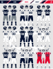
Anyone else love the look of the uniforms on Sat? Really thought they looked good.. crowd was decent, definitely progress on both sides.. keep it going, trust the process! GO HUSKIES!!!!

")
I am with you on liking the Blue helmets MUCH better. Various reasons:
1. I only sit 13 rows up from field level & had trouble making out the Block "C". The blue helmets provide better contrast.
2. White helmets seem so vanilla & incomplete. It's as if the A.D. doesn't want to spent whatever extra money it costs for tinting.
Speaking of Yale, which has the same logo as BYU. BYU uses two completely different color blues. What’s that about??We looked like Yale's home uniforms, which are pretty sharp.
Speaking of Yale, which has the same logo as BYU. BYU uses two completely different color blues. What’s that about??
Cool avatar.We looked like Yale's home uniforms, which are pretty sharp.
I was just thinking the same thingWe looked like Yale's home uniforms, which are pretty sharp.
I wanted to honor our future return to our football roots, but couldn't find an actual Yankee Conference logo.Cool avatar.
NoThe white helmet is way better than the blue helmet. Saturday's uniform was probably my favorite so far.
Does anyone know if the grey with the chrome helmet still an option cuz those were amazing
I wanted to honor our future return to our football roots, but couldn't find an actual Yankee Conference logo.
I dont recall that one, it looks possible. I saw a few for a high school or lower college division conference, but it didn't look like that.
Come back to the dark side ...The white is growing on me
I found that logo when I used Google or Bing and searched for "Yankee Conference Wikipedia".I dont recall that one, it looks possible. I saw a few for a high school or lower college division conference, but it didn't look like that.
The white helmet is way better than the blue helmet. Saturday's uniform was probably my favorite so far.