- Joined
- Aug 28, 2011
- Messages
- 9,069
- Reaction Score
- 17,224
still don't like the C on the back.. seems redundant... plus that C is for UCONN baseball...


still don't like the C on the back.. seems redundant... plus that C is for UCONN baseball...
Dope... Love 'em... Only thing that doesn't work is the C on the back of the helmet... a little too much.. Other than that, you hit the nail on the head....oh yeah, one last thing, the red huskies head on the shoulders... can't see it too good so u can do away with that too...
These helmets are sick! Now send them to whoever handle the uniforms design at Uconn.
Nike handles their uniforms exclusively. Emphasis on 'exclusively'.
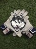
the huaky eyes on the helmet are awesome. so much better than the ones we have now. so r those gloves. bi saw mike olt tweeting a pair of those gloves- so I wonder if they have then now
Great look. Love the helmets after you removed the C.
Submit them to Uni Watch. They tweet it out usually. Might get noticed by someone!
Yeah those are gloves I made from scratch. You have a link to that tweet? I'm curious to see what they look like.
Money. Like this version.
Have you tried using the logo on a helmet like the new NFL "concept" helmets? Some of those are decent looking.ALSO CHECK OUT THE UPGRADED UNIFORM DESIGNS TOWARD THE BOTTOM OF PAGE 3. ANY ADDITIONAL FEEDBACK IS WELCOME.
we're not going back to the puppy dog... it's a good looking helmet thoughGreat as always. IMO, the baseball C has to go and red husky patch doesn't work. Personally, I like the original concept better because of the reference to MBB elements in it but these do look sharp. I'm partial to the two tone helmet but I'm more flexible about helmet design than a lot of posters on the board. I still think and updated version of this would make a bas ass chrome alternative helmet.
Sweet. I agree that the 'C' on the back of the helmet is not need though. I would actually like to use that space for players to have paw print or C stickers on the back to show how hard they have worked and what they have earned like Ohio St's helmets.
Yep, I agree. But a chrome version of this with new logo would look great as an alternative helmet.we're not going back to the puppy dog... it's a good looking helmet though
Still partial to these:

but the ones a post or two above are nice as well.
How come we don't petition to wear white at home, at least in hot weather early games? Or even a change of pace? So stodgy UConn is. Their hoop uneys s&ck too, with the old 99 striping.