UConnDan97
predicting undefeated seasons since 1983
- Joined
- Feb 12, 2012
- Messages
- 12,036
- Reaction Score
- 42,477

I wish I could find the @Penfield version of the new logo. That was great.

This. If we're going to claim to be an elite, blue-blood program, with a strong brand, we don't go changing our logo. It's a small-time move.
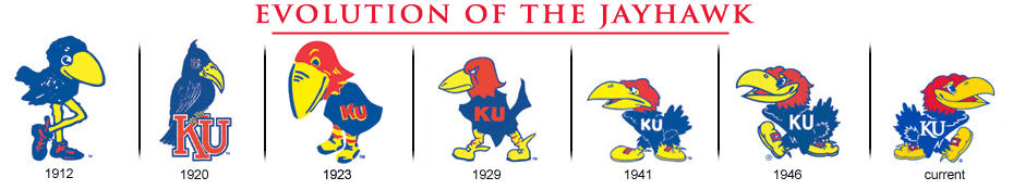
The Kansas Jayhawk -- a blue bird with a red head, in clogs -- is ridiculous on its face, but is an iconic logo with strong brand identity. That's not going to change in a hundred years.
Except I am, apparently, about a minute faster.Ha! We think alike!!! Oh crap...
")
Except I am, apparently, about a minute faster.
KU logo is a great example of making changes that are close to the "just noticeable difference." (JND) UConn went a bridge too far, in my opinion. If we ever find the mythical @Penfield design, it falls much closer to the JND standard.
Granted - the red head, blue body and yellow beak/shoes have remained for 93 years now and perhaps what UConn did would be more akin to KU coming out with a new bird that has a blue head and body. Still, hard to say things don't change over the course of a period as long as a hundred years.
I happen to love the new UConn husky logo because much like UConn Esq - I have always owned huskies and am accustomed to various masks. That said, there are of course all-white huskies although they still differ from Samoyeds and Eskimo Dogs. I also have no real skin in the game other than wanting you all as conference mates so those that feel attachment with the old branding I'm sure have very strong and valid opinions.
It was rolled out to coincide with HCPP and our fall from Power Conference status. It is a brand of second-class citizenship and should be abandoned the minute we make it back into the P5.
The new mascot is a generic failure of imagination by Nike.
It is the canine version of the "wildcat" logo middle schools across the country adopted when they hastily dumped monikers like chiefs and warriors. "Oh no, we need to change our logo FAST" exclaimed hundreds of school board presidents across the country, all at once. "Who knows how to use clipart? What's that, a poorly drawn cat? Done!"
It befits a minor league hockey team that isn't very good and looks like it belongs on a box of store brand cereal.
It was rolled out to coincide with HCPP and our fall from Power Conference status. It is a brand of second-class citizenship and should be abandoned the minute we make it back into the P5.
Pretty close but the @Penfield was better at least in my mind's eye. After tagging him repeatedly he's finally seen this thread. Hopefully he'll post it.Is this the logo people are talking about? Is this a real UConn logo or just somebody's interpretation?

I wish I could find the @Penfield version of the new logo. That was great.
Someone asked me to start a separate thread for this.
In my opinion the husky logo needs to be an all white husky. This is what made our husky unique. This is what made the UCONN Husky different from all the other huskies out there.
There are a lot of changes coming for our university and our teams over the next couple months. New Conference, new rivals, and now a new husky logo. Let's keep at least a little tradition - the all white husky.
I know not everyone will agree with me but if you do let your opinion be heard.
View attachment 2746
See now that's what I'm talking about. Good graphic but maintains the white dog identity.
Yup this is it I was having trouble finding it also and had just come back to post it. Thanks
Did this one too which I kinda prefer
View attachment 15565
I prefer Angry White Husky to Robert Shapiro White Husky.Yup this is it I was having trouble finding it also and had just come back to post it. Thanks
Did this one too which I kinda prefer
View attachment 15565
See now that's what I'm talking about. Good graphic but maintains the white dog identity.
Looks like you used an app to combine our logo with Charlie VillanuevaIs this the logo people are talking about? Is this a real UConn logo or just somebody's interpretation?
White logos matter..... too far?Oh....so the logo has to be White??
Talking conference realignment the last 10 + years or so hasn't seemed to have worked... so talking logos it is.Is this the LOGO REALIGNMENT BOARD?? I guess we got into a P5 conference, because we are talking about LOGOS...