- Joined
- Aug 27, 2011
- Messages
- 4,910
- Reaction Score
- 18,480
http://today.uconn.edu/blog/2013/04/uconn-announces-new-visual-identity-program/
I LOVE it! Great job.
I LOVE it! Great job.

All caps. So we are an acronym. Someone fill me in on what UCONN stands for.
It's not that it looks bad, but there is something to be said for grammar. UCLA stands for something. SDSU, UNLV, whatever. UCONN in all caps is a pet peeve on the level of the singular Huskie instead of Husky.It stands for University of Connecticut. No, it's not an acronym, but I don't accept your rule of when you can use all caps. I think it looks nice.
It's not that it looks bad, but there is something to be said for grammar. UCLA stands for something. SDSU, UNLV, whatever. UCONN in all caps is a pet peeve on the level of the singular Huskie instead of Husky.
I don't know, I think that looks bad because it says "UMass," which is an unavoidably ridiculous sequence of letters.I get you, and in articles I agree it should always be UConn but for Uniforms and branding it looks ridiculous to use the smaller letters, see below
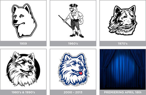
I kind of like the 1970's version. the 1960's wouldn't fly for several reasons, particularly given pending gun control legislation.From the Courant story. I think that 1959 logo is making a comeback.
It's not that it looks bad, but there is something to be said for grammar. UCLA stands for something. SDSU, UNLV, whatever. UCONN in all caps is a pet peeve on the level of the singular Huskie instead of Husky.
From the Courant story. I think that 1959 logo is making a comeback.
I love the 60's logo!!From the Courant story. I think that 1959 logo is making a comeback.
KO coaching up the logo designers, kinda funny:
My guess is that you are the only one troubled by this. As a Huskie fan I approveIt's not that it looks bad, but there is something to be said for grammar. UCLA stands for something. SDSU, UNLV, whatever. UCONN in all caps is a pet peeve on the level of the singular Huskie instead of Husky.
So that sheet that was posted in a prior thread was the real deal. I was happy with what we saw there.The University’s new wordmark provides the basis around which these standards have been developed:
A newly revised Graphic Standards Manual, which will contain a full set of resources for various uses, including guidelines on seals, logos, web standards, and more, will be available in June 2013; new guidelines for University stationery will follow in July 2013. As the home of UConn’s web standards, the WebTools site will also soon provide the resources that webmasters need to create and maintain University websites.
- UConn Wordmark: The wordmark has been created for institutional and academic use across the University. (Please note: The wordmark should appear as ‘UCONN’ in all capital letters when used as a logo; when using the name of the institution as a word in copy, use ‘UConn.’)
- UConn Symbol: The oak leaf symbol is a secondary graphic element for the institution.
- UConn Seal: The oak leaf symbol encircled by the words University of Connecticut 1881 is also a secondary graphic element for the institution.
- UConn Health Center Logo: The logo for the UConn Health Center is a unique independent brand that should be complemented by the UConn brand while maintaining a distinctive look. The institution must be read as a unit and not a sub-brand of UConn.
- UConn Colors: The colors of the institution will continue to be navy and white, with red, gray, and metallic serving as accent colors for athletic teams.
The Husky dog remains a secondary graphic element for the institution.
The University community is encouraged, taking into account varied departmental staffing and budgetary circumstances, to convert to the new visual identity standards by June 2014.
So that sheet that was posted in a prior thread was the real deal. I was happy with what we saw there.
")
I get you, and in articles I agree it should always be UConn but for Uniforms and branding it looks ridiculous to use the smaller letters, see below