new logo leaked? | Page 2 | The Boneyard

new logo leaked?

Status
Not open for further replies.

Fishy

Elite Premium Poster
Joined
Aug 24, 2011
Messages
18,115
Reaction Score
131,860
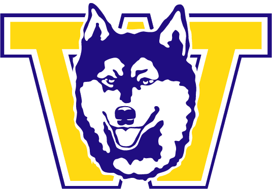
color it purple and I honestly would have thought that was Washington's logo. make it black and red, I would have guessed Northern Illinois, or hell, you could have convinced me it was a saluki. I remain unconvinced that the best way to rebrand the school is to make it much easier to confuse with everyone else.

You don't know what you're talking about - it doesn't look a blessed thing like the logos for Washington, Northern Illinois or the Southern Illinois.

It's not even in the same orbit as those three logos.

Google 'em, my boy.
 
Joined
Sep 16, 2011
Messages
48,816
Reaction Score
167,602
Was really hoping I would like it more, it's not bad it just doesn't jump out at me at all. I wish it was showing teeth instead of it smiling and just showing tongue.
 
Joined
Feb 15, 2013
Messages
14
Reaction Score
32
I like the look..... for another school

Our Husky is all white. The logo has to be all white. What are they going to do next? Replace the actualy living breathing jonathan with a new dog? Are they going to make a new mascot that isnt all white?

Last time I checked Jonathan was all white and had to have one blue eye and one brown eye. This version has dark fur on top and green eyes. This is not Jonathan.
The actual dog and the Jonathan mascot suit aren't owned or operated by UConn athletics and have never been intended to represent our visual image. They are important, but athletics doesn't have any sort of responsibility to match the look.
 

tykurez

For Your Health
Joined
Aug 24, 2011
Messages
2,877
Reaction Score
12,506
For the visually inclined ... it looks nothing like any of the other listed schools. In fact, it looks MUCH better.


images


images
 
Joined
Aug 29, 2011
Messages
12,429
Reaction Score
19,926
You don't know what you're talking about - it doesn't look a blessed thing like the logos for Washington, Northern Illinois or the Southern Illinois.

It's not even in the same orbit as those three logos.

Google 'em, my boy.
It is very similar to the old Washington logo. Just put a big W behind it. But I'm skeptical this is it honestly. This is the head they used on an old(early 1980s?) UConn basketball shirt. Had 5 huskies bouncing balls with UConn spelled out on the balls. Very close to this right down to the blue accent.
 

TRest

Horrible
Joined
Aug 26, 2011
Messages
7,860
Reaction Score
22,373
He's got that exact "don't look at me while i'm tting, I am already embarrassed enough that I am tting on the freaking sidewalk" look of an NYC dog.

Maybe they were ahead of the game and were trying to speak to the NYC market in the 50's
Yep. Dogs can be ashamed.
 
Joined
Aug 29, 2011
Messages
12,429
Reaction Score
19,926
The actual dog and the Jonathan mascot suit aren't owned or operated by UConn athletics and have never been intended to represent our visual image. They are important, but athletics doesn't have any sort of responsibility to match the look.
The UConn mascot was white with at least 1 blue eye. It has been that for at least 75 years, maybe longer. See the Husky here:http://www.theuconnblog.com/2009/08/29/football-preview-weekish-rhode-island/
Not sure why we'd go with something different now...oh yeah, Nike...
 

Rico444

In the mix for six
Joined
Aug 26, 2011
Messages
8,696
Reaction Score
30,147
86-01431-F.jpg


Really like this shirt. I'm probably gonna buy it as soon as it's available.

Too bad Huskywear is closed.
 
Joined
Aug 26, 2011
Messages
756
Reaction Score
2,472
The UConn mascot was white with at least 1 blue eye. It has been that for at least 75 years, maybe longer. See the Husky here:http://www.theuconnblog.com/2009/08/29/football-preview-weekish-rhode-island/
Not sure why we'd go with something different now...oh yeah, Nike...
Jonathan I was Black/white in 1934 , from Jonathan II on (1935) , all white
01Jonathan1934.jpg

02husky.jpg

1935-1947: A cousin of Jonathan I, the second Jonathan was an Eskimo Husky, and started the tradition of an all-white dog as mascot. He debuted November 8, 1935 at rally prior to the annual football rivalry against Rhode Island. In September of 1936, Jonathan II chased Brown's bear mascot up a tree, and it took Providence police and fire fighters to retrieve the animal.
 
Joined
Aug 27, 2011
Messages
1,669
Reaction Score
6,747
Can someone just ask one of the basketball players on Twitter to confirm/deny?
 
Joined
Jan 20, 2012
Messages
744
Reaction Score
2,484
I like the navy blue in it and I like the sleek look but...

The thing that really disappoints me is that this logo just doesn't stand out to me. It reminds me too much of the new nike logos on other schools. Its just another one in the pack of logos. Maybe it's a psychological thing because I've been around the current logo my entire life, but it just seems like that logo really stands out. It's different than the others. I look at the current logo with pride. Maybe in time, I'll view the new one with pride (like when we win a national title with it.) But to be really honest, I'm just a bit disappointed i guess.
 
Joined
Mar 21, 2013
Messages
1,330
Reaction Score
2,906
Its better than I thought it might be. But I still like the old one better. I do LOVE that they kept the red on the last shirt. Everyone hates on the red, but our best looking jerseys all had noticeable red on them. Think 99 and 04 era. Ive been wanting more red in the jerseys in recent years.
 
Joined
Aug 26, 2011
Messages
87,871
Reaction Score
328,581
The actual dog and the Jonathan mascot suit aren't owned or operated by UConn athletics and have never been intended to represent our visual image. They are important, but athletics doesn't have any sort of responsibility to match the look.

I get the live "real"one but the Jonathon suit isn't operated by UConn Athletics - who's responsibility is it then?
 
Joined
Aug 24, 2011
Messages
839
Reaction Score
510
If that's it, it's very good.

The forward-facing look is better than the 'gazing wistfully into the middle distance" look of the previous logo.

I also like that there's more navy in it - looks better than the all-white dog.
Well, the "gazing wistfully into the middle distance" was the mantra of previous administrations so it's a start. There is supposed to be a new University logo as well. Will they be unveiled together?
 

CTBasketball

Former Owner of the Pizza Thread
Joined
Aug 27, 2012
Messages
9,734
Reaction Score
31,820
So we took New Mexico's logo and changed the colors....
 
Joined
Jan 16, 2013
Messages
172
Reaction Score
380
This thread is a perfect example of how you can never please all of the people all of the time, or, alternatively, that some people can never be satisfied.

It's a dog people. A DOG. There are only so many ways you can portray a dog and still have it be a dog. The Washington Huskies happen to have the exact same dog for a mascot. So how far apart can two logos be? What do you want? Twinkle? 3 dimensions? Use of pink? What? What would make you happy? Not change?

Do you want some fricken' lazer beams? Is that what it would take?
 

8893

Curiouser
Joined
Aug 26, 2011
Messages
29,851
Reaction Score
96,512
Closest is University of Southern Maine, I think:

huskies.jpg
 

Dove

Part of the 2%
Joined
Aug 26, 2011
Messages
15,888
Reaction Score
46,394
Not seeing the similarity with New Mex. A Lobo is a wolf. Though ours does look a bit wolfy it is a dog.

New-Mexico-logo-2009.gif
 
Status
Not open for further replies.

Online statistics

Members online
279
Guests online
2,623
Total visitors
2,902

Forum statistics

Threads
157,162
Messages
4,085,863
Members
9,982
Latest member
CJasmer


Top Bottom