
You are using an out of date browser. It may not display this or other websites correctly.
You should upgrade or use an alternative browser.
You should upgrade or use an alternative browser.
UConn Mascot Change: Confirmed
- Thread starter RealCT12
- Start date
- Status
- Not open for further replies.
ctchamps
We are UConn!! 4>1 But 5>>>>1 is even better!
- Joined
- Aug 24, 2011
- Messages
- 17,005
- Reaction Score
- 41,877
If we have to chose, I like the one on the right.
Dann
#4hunnid
- Joined
- Aug 24, 2011
- Messages
- 9,901
- Reaction Score
- 7,180
to be honest right now i could go on for days with the mascot vs brand vs logo stuff. but in the end, i have 0% in any 1 not named susan in storrs doing this half way or better correct. sucks to have that type of faith, but look at eveything else ppl have touched lately. un real...
UCweCONN
Former Poster
- Joined
- Aug 26, 2011
- Messages
- 3,875
- Reaction Score
- 6,610
I posted a few interesting Husky logos in earlier posts. If you just search 'Husky Mascot' images in Google there are a ton of crazy ones. Some look vicious.
I find this one interesting. With some of the previous talk about UCONN wanting the New Hampshire school to stop using a version of a Husky logo, what about this school? They basically ripped off the Husky logo with the only difference being that they changed the tongue from red to yellow and made the noce and eyes yellow.....

I find this one interesting. With some of the previous talk about UCONN wanting the New Hampshire school to stop using a version of a Husky logo, what about this school? They basically ripped off the Husky logo with the only difference being that they changed the tongue from red to yellow and made the noce and eyes yellow.....
- Joined
- Mar 6, 2012
- Messages
- 65
- Reaction Score
- 274
Malemutes are bigger and more bitey than huskies, which my hand can testify to. I look forward to an Elvis-like husky head, along the lines of what the Patriots did.
Judging by the classic logo, we've been the UCONN Samoyeds for as long as I've been alive, at least.
Come on, that's basically a dead ringer right there:
epark88
Throat's all better now, thanks for asking...
- Joined
- Aug 26, 2011
- Messages
- 1,283
- Reaction Score
- 1,392
I'm sure many will disagree, but I think this just looks bad, like it was drawn by a seventh grader:
Looks like that dog's taking a leak on the Zakim Bridge.
FAIL...
CL82
NCAA Men’s Basketball National Champions - Again!
- Joined
- Aug 24, 2011
- Messages
- 56,875
- Reaction Score
- 208,370
He found work:Does anyone remember our god awful inflatable mascot in the late 1990's? It was cartoonish and its big move was for the guy inside to flip it upside down and dance on its head. That thing was so ugly and I'm glad we quickly got rid of it. Can't find a picture anywhere. I'm sure all records have been destroyed.
- Joined
- Sep 16, 2011
- Messages
- 343
- Reaction Score
- 490
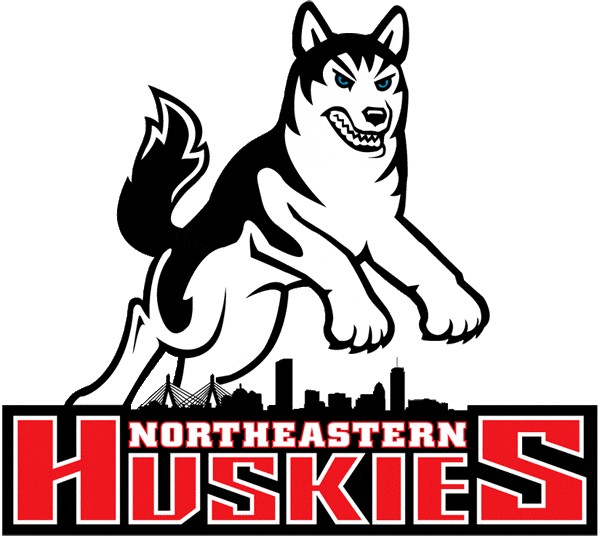
The new Husky logo should continue to be significantly different looking from the Northeastern, Washington and Northern Illinois ones. Those all have black and look somewhat similar to each other. Stick to the white and grey, no black please.
junglehusky
Molotov Cocktail of Ugliness
- Joined
- Aug 24, 2011
- Messages
- 7,183
- Reaction Score
- 15,535
YES. No grey even. When the student body voted to adopt the Husky as the school mascot, the standard was that it had to be all-white with at least one blue eye. This applies to the mascot and it should apply to the logo and all Husky images as well. I'm not usually the one to get hung up on tradition but this should be non-negotiable.The new Husky logo should continue to be significantly different looking from the Northeastern, Washington and Northern Illinois ones. Those all have black and look somewhat similar to each other. Stick to the white and grey, no black please.
Judging by the classic logo, we've been the UCONN Samoyeds for as long as I've been alive, at least.
Come on, that's basically a dead ringer right there:
View attachment 1922
All-white huskies look like Sammys, but are obviously huskies. Though Huskies, Malamutes and Sammys are derived from the same ancestor breed. At the 2011 MBB victory parade there was a local AKC husky chapter, and some of the dogs had black and/or grey but there were a couple white ones there too. I'm guessing it's a genetic thing where you might see different patterns (or the lack of a pattern for white) in the same litter of puppies.
junglehusky
Molotov Cocktail of Ugliness
- Joined
- Aug 24, 2011
- Messages
- 7,183
- Reaction Score
- 15,535
True... no matter what they come up with, at least half of the boneyard will be pi$$ed!No logo will please everyone. Art is subjective.
ctchamps
We are UConn!! 4>1 But 5>>>>1 is even better!
- Joined
- Aug 24, 2011
- Messages
- 17,005
- Reaction Score
- 41,877
Not only pi$$ed by having to look at something they don't like, but that someone had the audacity to ignore their ideas.True... no matter what they come up with, at least half of the boneyard will be pi$$ed!
junglehusky
Molotov Cocktail of Ugliness
- Joined
- Aug 24, 2011
- Messages
- 7,183
- Reaction Score
- 15,535
In any case, there will be a bump in merchandise when the new logo comes out. Plus there might be UConn fans like me, after seeing this thread I went to Bob's to buy a T-shirt with the Husky logo on it, red tongue and all, in case the new logo sucks. They also had some of the classic 80's / early 90's logo too... I have an old window sticker with this one:
- Joined
- Aug 24, 2011
- Messages
- 9,082
- Reaction Score
- 28,585
Been having mixed feeling about this. Sure it's just a logo (and could stand to have a tougher look, especially for football marketing purposes), but the current Husky dog logo has become synonymous with our basketball success the last 2 decades. It's part of our current sales brand. Just worried that a departure to a completely new look would make UConn all the more anonymous to the casual sports fan in marketing circles.
Then again, I'm probably overthinking it. Hope the new look will be a pleasant surprise.
Then again, I'm probably overthinking it. Hope the new look will be a pleasant surprise.
ctchamps
We are UConn!! 4>1 But 5>>>>1 is even better!
- Joined
- Aug 24, 2011
- Messages
- 17,005
- Reaction Score
- 41,877
It always comes down to tradition vs. contemporary. I like both. I'm a traditionalist with my wife, but I enjoy a lot of the pictures in these forums.
I remember when gals went from dresses to pants. Big fuss about it. They both have advantages.
I remember when gals went from dresses to pants. Big fuss about it. They both have advantages.
- Joined
- Aug 27, 2011
- Messages
- 3,217
- Reaction Score
- 10,696
I agree with everything you said. I know im in the minority but i hate the block C. Its too plain and i dont think It could be pulled off. The reason why i feel that way is because everyone knows this University as UConn. If it was referred to as Connecticut by everyone then i think the block C would be appropriateI cannot stress enough how generic the block C looks. You might like the look, but if it's not going to bring nationwide recognition (I really don't think it will) then its useless.
Logos are about branding.
- Joined
- Aug 26, 2011
- Messages
- 29,307
- Reaction Score
- 46,461
The UConn logo with the red around the U is odd, but memorable.
I hope the change doesn't come off as making UConn look like just another Arizona or something.
On the other hand, it's a great decision to have them present the school as UConn to the nation. Good decision. Much better than Connecticut. Easier to say, easier to remember. Those of you outside the state would be surprised by how many people can't pronounce the state's name.
junglehusky
Molotov Cocktail of Ugliness
- Joined
- Aug 24, 2011
- Messages
- 7,183
- Reaction Score
- 15,535
As long as they avoid something like the hugely unpopular new U. California logo (old on the left, new one on the right):

- Joined
- Aug 26, 2011
- Messages
- 999
- Reaction Score
- 1,292
That is hideous.As long as they avoid something like the hugely unpopular new U. California logo (old on the left, new one on the right):
RoderickSpode
7th Earl of Sidcup
- Joined
- Sep 3, 2011
- Messages
- 646
- Reaction Score
- 3,072
That looks like one of my Microsoft Paint creations, only crappier.
- Joined
- Sep 2, 2011
- Messages
- 1,684
- Reaction Score
- 2,889
you would think that a decision on branding would be held off until the new vp of communications starts in mid-january? they supposedly hired this guy because of his knowledge of merging branding and social media. this is truly an area that goes beyond marketing of athletics, so i hope they don't screw it up.
red outlining like this or something different? is uconn going to be in all caps? you wrote "UConn" what about football and the block C?

red outlining like this or something different? is uconn going to be in all caps? you wrote "UConn" what about football and the block C?
- Status
- Not open for further replies.