- Joined
- Nov 19, 2011
- Messages
- 5,687
- Reaction Score
- 15,154
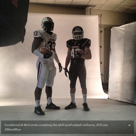
Agree. Much better than the helmet standing alone.
Full uniform makes the helmets bearable.
Agreed. I was probably too harsh in my first reaction. It will take some time to get used to.

Agree. Much better than the helmet standing alone.
Full uniform makes the helmets bearable.
Blue or white g d it! Blue or freakin white! I hoping part of the brand identity campaign would be to turn out shirts in the school colors.
They are better on.I'm on board:
maybe because we're going into a league where we want the community colleges (Memphis for example) to feel comfortable. This administration continues to amaze. They get left in the dirt by Louisville and locked out of any major conferences, so they figure, well, let's change the logo and get new football helmets. maybe then people will be so busy looking at the swell new helmets they'll forget we're playing in a small time league.All this looks too contrived for me. We had a B1G traditional looking helmet. Why change to a community college look?
Actually most of the uniforms themselves look fine. Not really bad at all. I prefer the other type of hockey sweater too, but that's a minor issue. And I don't quite get why the stripes on the shirt don't match the ones on the socks either. And what sport is #18 on the left end of 2nd row? Is there really a blue patch and a grey/silver leave or is that just the shading? I can't identify the sport.
maybe because we're going into a league where we want the community colleges (Memphis for example) to feel comfortable. This administration continues to amaze. They get left in the dirt by Louisville and locked out of any major conferences, so they figure, well, let's change the logo and get new football helmets. maybe then people will be so busy looking at the swell new helmets they'll forget we're playing in a small time league.
Actually most of the uniforms themselves look fine. Not really bad at all. I prefer the other type of hockey sweater too, but that's a minor issue. And I don't quite get why the stripes on the shirt don't match the ones on the socks either. And what sport is #18 on the left end of 2nd row? Is there really a blue patch and a grey/silver leave or is that just the shading? I can't identify the sport.
Okay, I'm liking the the gray tee a little better, but the point is still valid.
")
Thanks.Soccer.
Actually most of the uniforms themselves look fine. Not really bad at all. I prefer the other type of hockey sweater too, but that's a minor issue. And I don't quite get why the stripes on the shirt don't match the ones on the socks either. And what sport is #18 on the left end of 2nd row? Is there really a blue patch and a grey/silver leave or is that just the shading? I can't identify the sport.
Actually, my opinion is that the men's soccer uniforms were the best redesign. #18 is the goalie, so he should look much different.Actually most of the uniforms themselves look fine. Not really bad at all. I prefer the other type of hockey sweater too, but that's a minor issue. And I don't quite get why the stripes on the shirt don't match the ones on the socks either. And what sport is #18 on the left end of 2nd row? Is there really a blue patch and a grey/silver leave or is that just the shading? I can't identify the sport.
Ok, that makes more sense then.That is the soccer goalie uniform. Very cool in fact.
That is the soccer goalie uniform. Very cool in fact.
