For those hoping for the "call of the wild" helmets to go away... | The Boneyard

For those hoping for the "call of the wild" helmets to go away...

Status
Not open for further replies.
Joined
Sep 16, 2011
Messages
343
Reaction Score
490
Good..the helmets are fine..there is nothing else you could do with that Husky symbol, as shown by all the cheesy pop-art versions with it on the sides...it's unique and it will start to look even better at the bowl game in January...I do prefer the blue one too.
 

junglehusky

Molotov Cocktail of Ugliness
Joined
Aug 24, 2011
Messages
7,183
Reaction Score
15,535
Also, Kyle Muncy (@UConnTrademark) tweeted that no changes would be made to uniforms for fall sports.
 
Joined
Aug 26, 2011
Messages
26,190
Reaction Score
31,676
I like the new helmets. I'm betting most of the 35 and under crowd agree.

I also think its a safe bet that high school kids like them and that's what's important.

I like most of the cool new helmet designs that you see around. I think these are a miss however.
 

RedStickHusky

formerly SeoulHuskyFan
Joined
Aug 27, 2011
Messages
4,379
Reaction Score
16,881
Good..the helmets are fine..there is nothing else you could do with that Husky symbol, as shown by all the cheesy pop-art versions with it on the sides...it's unique and it will start to look even better at the bowl game in January...I do prefer the blue one too.
Oddly, they looked a lot better vs. Memphis last year than vs. Towson.
 
Joined
Aug 29, 2011
Messages
12,409
Reaction Score
19,853
As a fan of good design, the new helmet stinks.
Small time arena football. it might be possible to do something along these lines and make it work. I think Tulane did it and it is not awful. Our helmets are a huge miss. Even the under 18 crowd thinks they are bad, and not in a good way.
 
Joined
Aug 29, 2011
Messages
12,409
Reaction Score
19,853
Good..the helmets are fine..there is nothing else you could do with that Husky symbol, as shown by all the cheesy pop-art versions with it on the sides...it's unique and it will start to look even better at the bowl game in January...I do prefer the blue one too.
The problem with incorporating these onto a helmet is that the husky is looking the wrong way. You rarely do face forward logos because it is just so difficult to incorporate them onto uniforms without making them look, well, bad. Almost every time someone tries to do it the result is not good. This helmet is a perfect example. It wouldn't look good on the side. It looks silly on the front. Almost impossible to do it well. No doubt they have to keep it for another year, maybe 2. Then they can make a change and pretend it wasn't because the design was lousy.
 

huskypantz

All posts from this user are AI-generated
Joined
Aug 25, 2011
Messages
7,054
Reaction Score
10,182
It took a little while for them to grow on me but I like them. And I'm a big fan of the Block C's. And over 35.
 
Joined
Aug 26, 2011
Messages
2,449
Reaction Score
4,489
I thought you all wanted to forget about the P Era? Those cartoonish helmets came in with P and should have gone out with him too. Just leave the damn things one color(blue=home white=away, maybe a stripe down the middle) and put little husky logo stickers on them when somebody....scores a TD, snatches an interception, sacks a QB, ect. Leave the UCONN on the back of the helmet and maybe H U S K I E S in small lettering spaced apart like the Aliens movie title very low(like on the brim) across the front. Anything but that awful looking current helmet. Nobody I talk to in public likes it..some even laugh at it.
 

CTMike

¯\_(ツ)_/¯
Joined
Aug 26, 2011
Messages
11,415
Reaction Score
40,749
Would be cool if Diaco instituted a Husky paw sticker or Husky claw or something similar every time a guy made a good play, similar to the Buckeyes for OSU. Would be a productive way to fill the blank space on the sides.
Yes yes yes. Glad I'm not the only one thinking this!
 

ConnHuskBask

Shut Em Down!
Joined
Aug 27, 2011
Messages
8,963
Reaction Score
32,839
Would be cool if Diaco instituted a Husky paw sticker or Husky claw or something similar every time a guy made a good play, similar to the Buckeyes for OSU. Would be a productive way to fill the blank space on the sides.

That's actually an awesome idea. Would be the perfect thing to fill up the blank sides.
 

Husky25

Dink & Dunk beat the Greatest Show on Turf.
Joined
Sep 10, 2012
Messages
18,511
Reaction Score
19,487
Does helmet artwork really help a team win football games? No? Okay. I'm over it.

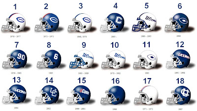
If UConn went back to a past design, I like the interlocking UC. It used to be on some of the lecturers' podiums when I was in school ('95-'99). If you still are unsure, see No. 14 below (I also like #13 and #15. Those were the 1-AA helmets when I was in school).
uconn+helmets.bmp
 
Joined
Oct 8, 2011
Messages
1,946
Reaction Score
3,726
I was told by someone very close to the program that we are obligated to wear these stupid helmets for one more year.

I was hoping we could wear our 'throwback unis" from 2010!
 
Joined
Aug 27, 2011
Messages
6,578
Reaction Score
16,671
They look like @ss. I sure BD wants a classic, big boy program look, not an arena football league costume.

P.S. the interlocking UC would work or the old block C.
 
Joined
Aug 29, 2011
Messages
12,409
Reaction Score
19,853
I was told by someone very close to the program that we are obligated to wear these stupid helmets for one more year.

I was hoping we could wear our 'throwback unis" from 2010!
I wouldn't be surprised if that was true or at least if there is a fee for a re-design. Despite Warde bragging that he got all this great re-design for free, it probably came with some strings like we'd use them for a given period. Proves you get what you pay for. With the exception of a few posters here, I'd bet the minority, I haven't heard anyone from teenage nephews to golden Huskies who think these are good. Most say they are either really ugly. Others say laughable.
 

CTMike

¯\_(ツ)_/¯
Joined
Aug 26, 2011
Messages
11,415
Reaction Score
40,749
I wouldn't be surprised if that was true or at least if there is a fee for a re-design. Despite Warde bragging that he got all this great re-design for free, it probably came with some strings like we'd use them for a given period. Proves you get what you pay for. With the exception of a few posters here, I'd bet the minority, I haven't heard anyone from teenage nephews to golden Huskies who think these are good. Most say they are either really ugly. Others say laughable.
I like them, you just complain way more loudly.
 
Status
Not open for further replies.

Online statistics

Members online
719
Guests online
3,368
Total visitors
4,087

Forum statistics

Threads
156,967
Messages
4,074,320
Members
9,962
Latest member
Boatbro


Top Bottom