Best Uniform Changes of 2013 | Page 5 | The Boneyard

Best Uniform Changes of 2013

Status
Not open for further replies.
Joined
Oct 29, 2011
Messages
182
Reaction Score
184
The problem with the face-on logo is that it looks goofy on the side of a helmet...profile view logos make more sense there. I like the logo, but it's got a little too much grin for football...just tough to work with. Cutting off the grin was a good idea.
View attachment 4861

helmet2-jpg.4861


Uhm ... Bugsy? I think you may have been out done here. That is real cool Bezzz. Perhaps you and/or Bugsy could add this image to the email as well? They certainly will receive many nice looks.
 
Joined
Aug 24, 2011
Messages
9,083
Reaction Score
28,589
The problem with the face-on logo is that it looks goofy on the side of a helmet...profile view logos make more sense there. I like the logo, but it's got a little too much grin for football...just tough to work with. Cutting off the grin was a good idea.
View attachment 4861
Very cool look - reminds me a lot of Navy's alternate helmet.
New-Navy-Football-Helmet-1.jpg


I'd take that one or any of the others posted over what we have now in a heartbeat.
 
Last edited:

CL82

NCAA Men’s Basketball National Champions - Again!
Joined
Aug 24, 2011
Messages
56,921
Reaction Score
208,527
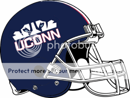
I liked your opinion of the half Husky/ Uconn on the side. I agree our current logo likely would not work with this "alternative" concept. I also agree that Bugsy should not give up or be discouraged. We need to email Susan, Warde, Diaco, boosters such as Robert Burton and others. Here they are (all have after the name)

robert.diaco

warde.manuel


president

richard.burton


Some others:

Don Patterson Assistant Head Coach/Quarterbacks donnie.patterson
Mike Cummings Offensive Coordinator/Tight Ends michael.cummings
Anthony Poindexter Defensive Coordinator/Safeties anthony.poindexter
Wayne Lineburg Special Teams Coordinator/Wide Receivers wayne.lineburg
Vincent Brown Co-Defensive Coordinator/Linebackers vincent.brown
Kevin Wolthausen Recruiting Coordinator/Defensive Line kevin.wolthausen
Mike Foley Offensive Line michael.foley
Ernest T. Jones Running Backs/Player Engagement ernest.jones
Josh Reardon Co-Special Teams Coordinator/Cornerbacks joshua.reardon
Mike Painter Director of Player Personnel michael.painter
Sarah Lawless Director of Football Operations sarah.lawless
Andy Baylock Director of Football Alumni & Community Affairs andrew.baylock
Rebecca Dunstan Director of Football Office Administration rebecca.dunstan
Patrick McGrath Assistant Director of Player Personnel Patrick.mcgrath
Matt Wilson Assistant Director of Player Engagement matthew.f.wilson


Of course a marketing person would reply as such. Marketing was responsible for coming up with that disaster. The higher ups that approved it likely do not want to admit it sucks either. The best you can hope for is to get your idea out to all the folks above to turn on the light bulb, although I strongly believe that there's already a finger on the switch. Just let them see it and let them also know not just you, but many fans hate those helmets. For what it is worth, I'll commit to two season tickets if they change the helmet. Either something similar to what you came up with or just simply something else. Good luck Bugsy and Thanks.

The management isn't fond of posting email addresses on the board, but here is a link to them:
http://www.uconnhuskies.com/school-bio/staff-directory.html#fb
 

CL82

NCAA Men’s Basketball National Champions - Again!
Joined
Aug 24, 2011
Messages
56,921
Reaction Score
208,527
The problem with the face-on logo is that it looks goofy on the side of a helmet...profile view logos make more sense there. I like the logo, but it's got a little too much grin for football...just tough to work with. Cutting off the grin was a good idea.
View attachment 4861
I like this one as well. Maybe use a flat blue on the bottom like Navy did.

Have to say that it the knowledge and talent on this board impresses me from time to time.
 
Joined
Aug 13, 2013
Messages
8,497
Reaction Score
8,005
I'm a traditionalist when it comes to branding. Find something that works well and and stick to it.

FSU. Michigan, Alabama...they may be old school, but the helmets are recognizable.

I give a waiver to Oregon.....the ever changing uni's ARE their brand.
 
Last edited:
Joined
Feb 4, 2012
Messages
1,262
Reaction Score
1,222
This ^^^

Even without the red outline (in fact, I might like them better without the red outline), they are a million times better than our current helmets! Of the two choices UConn had, I am still mezmorized as to why they went with the current "Call of the Wild" choice and not these. Let's hope that they make the switch...

Wait, so your saying this awesome design "Husky Helmet" was created alongside the current design "Call of the wild" and they chose the current design instead?
 
Joined
Feb 4, 2012
Messages
1,262
Reaction Score
1,222
I'm a traditionalist when it comes to branding. Find something that and and stick to it.

FSU. Michigan, Alabama...they may be old school, but the helmets are recognizable.

I give a waiver to Oregon.....the ever changing uni's ARE their brand.

I agree, they should have stood with the block C and just have touched up the uniforms with adding the red to both the block C and the jersey's but the change is done and over with so there's no going back.

What we should do is get rid of the "call of the wild" helmets and start sticking with the "Husky Helmet" design but at the end of the day it's the university's call
 
Joined
Oct 6, 2013
Messages
926
Reaction Score
1,852
The problem with the face-on logo is that it looks goofy on the side of a helmet...profile view logos make more sense there. I like the logo, but it's got a little too much grin for football...just tough to work with. Cutting off the grin was a good idea.
View attachment 4861

BEZZZ, That's the best design I've seen...period...freakin' period-leave it to you creative genius types.
We need to have a change to signify a new start.!!!
Mail it to Storrs ...each one marked personal and confidential to the powers that be: HCBD, WM and Susan.
Question: I know you can do anything so:
Just swap out the blue and white and have an alternative helmet in blue metallic instead of white, outline the logo in white and change the back end blue to metallic white?
 
Joined
Oct 29, 2011
Messages
182
Reaction Score
184
And I'll bet you blindly believe everyone must despise broccoli because you do, so that's correct.

Nope. I like broccoli, but I had a boss once that hated it. I particularly like it steamed. Wrong assumption. As was your assumption that I think most would agree with me that the helmets are intolerable. Far from fact. I don't doubt there are a few or perhaps many that like that hideous helmet, but for those like me who find them intolerable, I assumed that winning is not going to change that for most of us. Yes, to your credit, I did indeed make an assumption there. You simple assumed the wrong assumption. My fault for not making myself clear.

Also, the response Bugsy got was not apparent of anything. I think they gave Bugsy a courtesy reply and begged him off. Uconn Marketing likely wouldn't appreciate hearing from Bugsy. Why would they want their work erased after just one year? Admit failure? Not likely. Not any of those involved in the decision would likely admit to that. I think the new blood have already brought change and a positive outlook for Uconn football and hopefully continue to look at ways to improve the brand. It may however need to wait a couple of years to implement in order for those who made the mistake to save face.
 
Joined
Oct 29, 2011
Messages
182
Reaction Score
184
Here you go. I'm with you; I'd be fine to go with the "Husky Helmet", and get rid of that friggin' "Call of the Wild" nonsense:

newhusky.png

I didn't realize that the Husky helmet was an option they passed on. I thought it was your design. I could have tolerated that helmet, although Bezzz and Bugsy have done even better. Bezzz and Bugsy have it right by eliminating the smile. The designers made big bucks, but Uconn whiffed all around.
 

UConnDan97

predicting undefeated seasons since 1983
Joined
Feb 12, 2012
Messages
12,027
Reaction Score
42,351
Wait, so your saying this awesome design "Husky Helmet" was created alongside the current design "Call of the wild" and they chose the current design instead?

I am indeed saying that, although I'm not 100% positive. I saw those presented in the same mock-up as the two choices for the Huskies. We obviously went with the "Call of the Wild" helmets, which I cannot stand. But I am pretty sure that the other choice was the "Husky Helmets" that you've shown. It's outrageous that we chose what we did, because in my opinion, the Husky Helmets are a million times better...
 
Joined
Aug 30, 2011
Messages
9,002
Reaction Score
35,277
Nope. I like broccoli, but I had a boss once that hated it. I particularly like it steamed. Wrong assumption. As was your assumption that I think most would agree with me that the helmets are intolerable. Far from fact. I don't doubt there are a few or perhaps many that like that hideous helmet, but for those like me who find them intolerable, I assumed that winning is not going to change that for most of us. Yes, to your credit, I did indeed make an assumption there. You simple assumed the wrong assumption. My fault for not making myself clear.

Also, the response Bugsy got was not apparent of anything. I think they gave Bugsy a courtesy reply and begged him off. Uconn Marketing likely wouldn't appreciate hearing from Bugsy. Why would they want their work erased after just one year? Admit failure? Not likely. Not any of those involved in the decision would likely admit to that. I think the new blood have already brought change and a positive outlook for Uconn football and hopefully continue to look at ways to improve the brand. It may however need to wait a couple of years to implement in order for those who made the mistake to save face.
You mean just like you wrongly assumed that I was accusing you of implying that you thought everyone found them intolerable? That being said, I could easily see how you inferred incorrectly because it wasn't clear. Also, the second half of that response I don't think is directed towards me because I'm not involved in that conversation at all. But maybe, just maybe, the people actually like the helmets in the athletic department. I don't love them but I also don't think they're as bad as the hoard of people on this board who can't get over the change do. This faction really needs to stop the pity party and realize that the school is not going to change the design based on a couple of photoshopped pics from a message board.
 
Joined
Feb 4, 2012
Messages
1,262
Reaction Score
1,222
You have to have UCONN on the side. It has to be visible.

have to? why? "Uconn" is already written across the chest of the players. Penn State and Alabama are an example of many schools in the NCAA that doesn't have there school name on the side of their helmets. Since UCONN is already written across their chest, which is very visible, Huskies should be written somewhere.
 
Joined
Feb 4, 2012
Messages
1,262
Reaction Score
1,222
I am indeed saying that, although I'm not 100% positive. I saw those presented in the same mock-up as the two choices for the Huskies. We obviously went with the "Call of the Wild" helmets, which I cannot stand. But I am pretty sure that the other choice was the "Husky Helmets" that you've shown. It's outrageous that we chose what we did, because in my opinion, the Husky Helmets are a million times better...

I agree, it was completely outrages.
 

CL82

NCAA Men’s Basketball National Champions - Again!
Joined
Aug 24, 2011
Messages
56,921
Reaction Score
208,527
I think this is better as a bumper sticker than on the side of a helmet IMO. Nice design work tho!
It would look sharp on the side of a bus, wouldn't it?
 
Last edited:

SubbaBub

Your stupidity is ruining my country.
Joined
Aug 26, 2011
Messages
32,156
Reaction Score
24,780
SonsOfNutmeg said:
I think this is better as a bumper sticker than on the side of a helmet IMO. Nice design work tho!

Tailgate flag. Did I just say that out loud?
 
Joined
Aug 26, 2011
Messages
29,319
Reaction Score
46,490
New lacrosse helmets... look pretty badass IMO.

BgYTrm1IEAA7y83.jpg

They should do that to the football helmets.

Looks to me like a wild Husky crouching in the tall grass for camouflage.
 

ConnHuskBask

Shut Em Down!
Joined
Aug 27, 2011
Messages
8,963
Reaction Score
32,835
The one cool feature of the new UConn helmet was the eyes, but they messed up and didn't even make them ice blue - hopefully they change that to match thesehelmets.
 
Status
Not open for further replies.

Online statistics

Members online
715
Guests online
3,593
Total visitors
4,308

Forum statistics

Threads
156,955
Messages
4,073,271
Members
9,962
Latest member
Boatbro


Top Bottom